Hello,
I have recently been using pyjls library to read Joulescope’s GPI signals from a JLS file recorded with Joulescope UI.
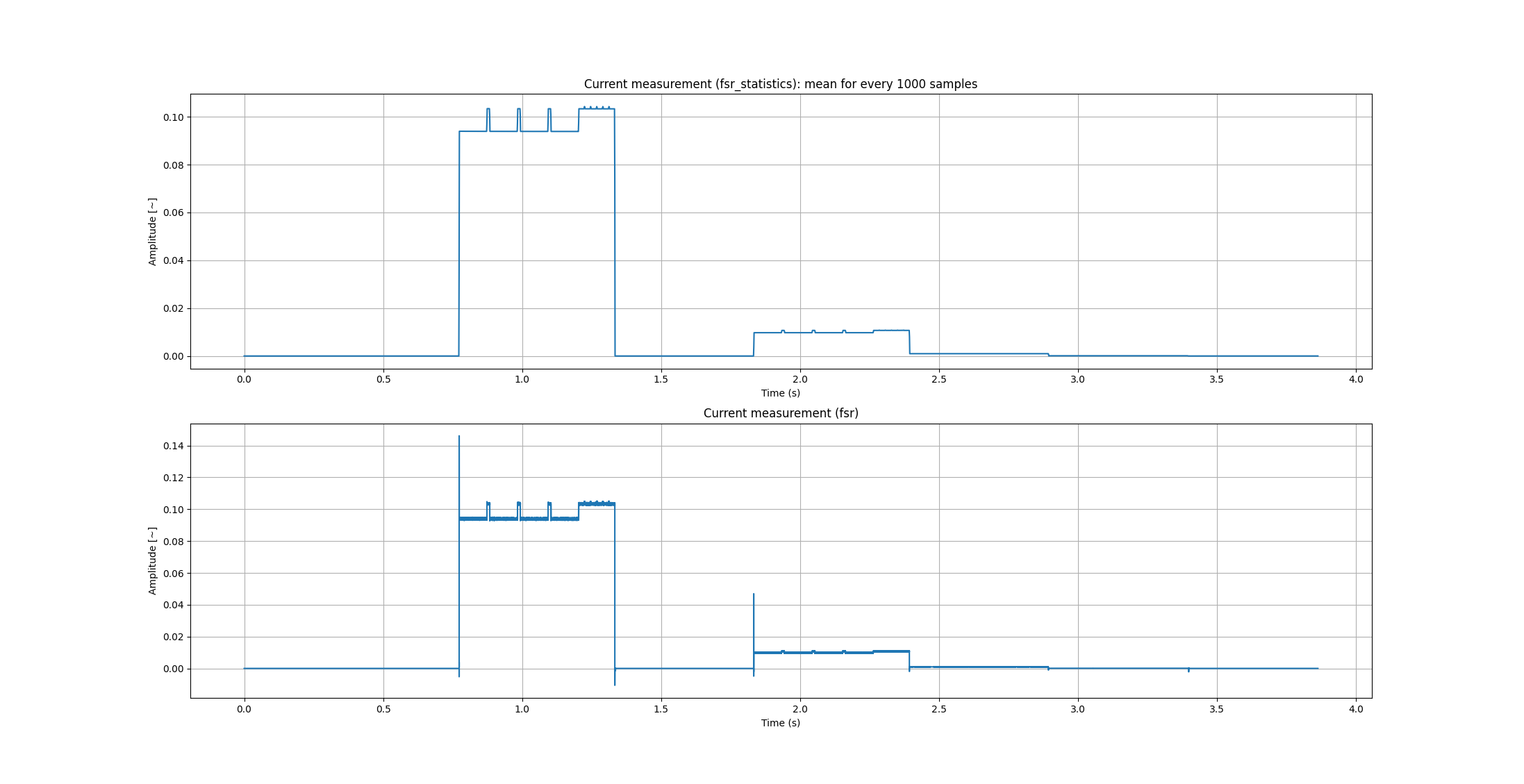
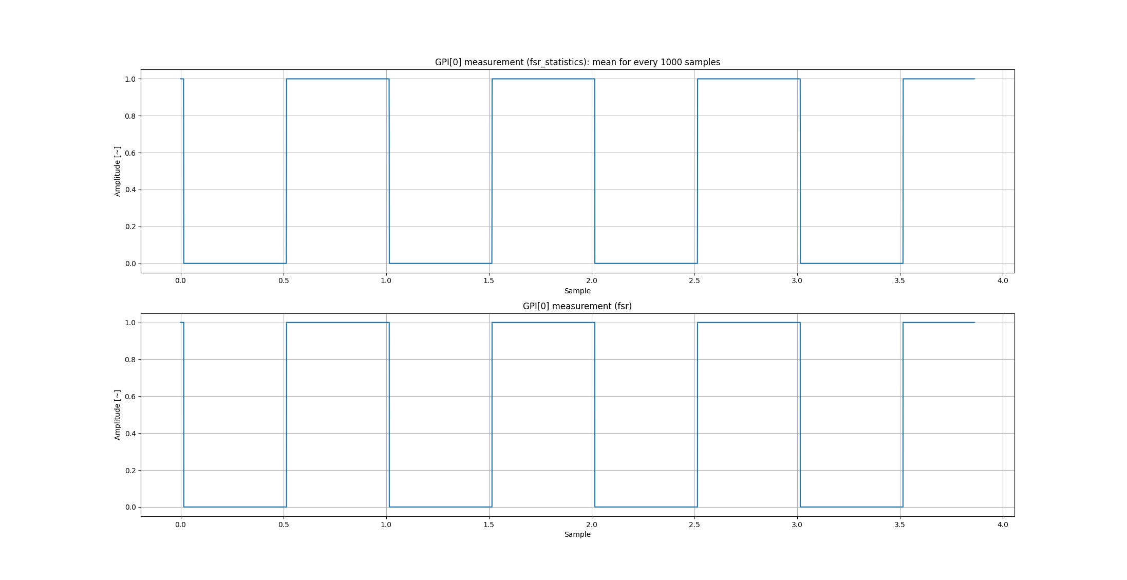
Since reading the whole measurement results using fsr() method is insufficient for further post-processing, I have started using fsr_statistics() method instead. It works great with current signal, but I have noticed stranger behavior when comparing these two methods for GPI signals…
Below is my Python script, which I use to visualize data from a JLS file with matplotlib library:
import numpy as np
from pyjls import Reader
import matplotlib.pyplot as plt

FILE_PATH = r"########.jls"
FIXED_VAL = 1000

with Reader(FILE_PATH) as r:
    current_signal = r.signal_lookup('current')
    reading_fsrstats_current = r.fsr_statistics(current_signal.signal_id, 0, FIXED_VAL,
                                                int(current_signal.length / FIXED_VAL))[:, 0]
    reading_fsr_current = r.fsr(current_signal.signal_id, 0, current_signal.length)

    gpi0_signal = r.signal_lookup('gpi[0]')
    reading_fsrstats_gpi0 = r.fsr_statistics(gpi0_signal.signal_id, 0, FIXED_VAL,
                                                int(gpi0_signal.length / FIXED_VAL))[:, 0]
    reading_fsr_gpi0 = r.fsr(gpi0_signal.signal_id, 0, gpi0_signal.length)

# Plot current signal
reading_fsrstats_current_tvec = np.arange(0, reading_fsrstats_current.size)
reading_fsr_current_tvec = np.arange(0, reading_fsr_current.size)

plt.figure()
plt.subplot(2,1,1)
plt.plot(reading_fsrstats_current_tvec, reading_fsrstats_current)
plt.title('Current measurement (fsr_statistics): mean for every %d samples' % FIXED_VAL)
plt.xlabel('Sample')
plt.ylabel('Amplitude [~]')
plt.grid()
plt.subplot(2,1,2)
plt.plot(reading_fsr_current_tvec, reading_fsr_current)
plt.title('Current measurement (fsr)')
plt.xlabel('Sample')
plt.ylabel('Amplitude [~]')
plt.grid()

# Plot GPIO[0] signal
reading_fsrstats_gpi0_tvec = np.arange(0, reading_fsrstats_gpi0.size)
reading_fsr_gpi0_tvec = np.arange(0, reading_fsr_gpi0.size)

plt.figure()
plt.subplot(2,1,1)
plt.plot(reading_fsrstats_gpi0_tvec, reading_fsrstats_gpi0)
plt.title('GPI[0] measurement (fsr_statistics): mean for every %d samples' % FIXED_VAL)
plt.xlabel('Sample')
plt.ylabel('Amplitude [~]')
plt.grid()
plt.subplot(2,1,2)
plt.plot(reading_fsr_gpi0_tvec, reading_fsr_gpi0)
plt.title('GPI[0] measurement (fsr)')
plt.xlabel('Sample')
plt.ylabel('Amplitude [~]')
plt.grid()
plt.show()
Here are the two plots I obtained:
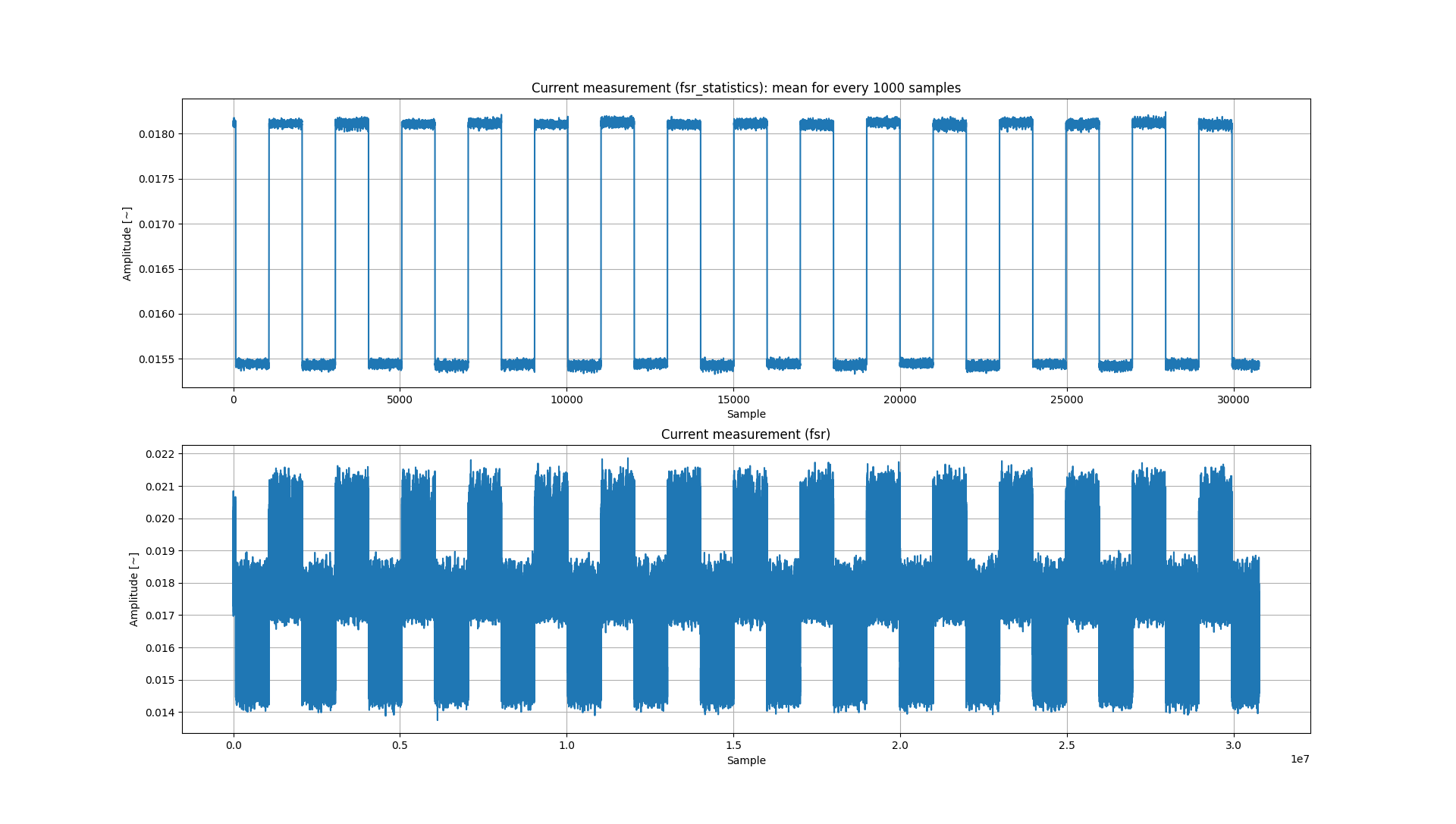
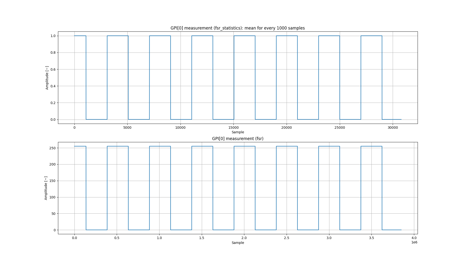
The part I do not understand is:
Why are the subplots of the GPI[0] signal not aligned with each other?
Why is sample 15,000 from the upper plot near the 4th rising edge, while sample 1.5e6 is in the middle of the 3rd full high state?
Is this some kind of bug, or am I missing something?
Thanks in advance for your support!
My environment:
- OS: Win-11
- Joulescope: JS110
- Joulescope App:
- UI: 1.2.5
- driver: 1.7.2
- JLS: 0.11.1
- Python 3.11.9
- Platform: Windows-10-10.0.22631-SP0
- Python: 3.13.1
- Python Packages:
- pyjls: 0.11.1
- matplotlib 3.10.0